Okay, for those of you who saw this post and reacted, "Are we STILL trying to figure this out?" I hear you. But I request that you tuck your smugness away for just a moment and remember that there is never a bad time to evaluate your website. And at the same time, yes, we are still talking about this, and sometimes I am still taken aback by the state of many churches' website presence.
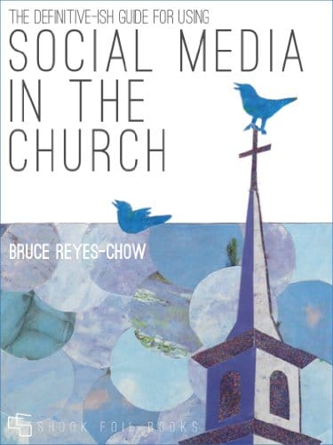
But before we begin, let's begin with the prayer from the introduction of the 2012 no-award-winning, now-out-of-print eBook, The Definitive-ish Guide for Using Social Media in the Church (Shookfoil Books). For those who remember when this came out, it was 14 friggin' years ago.
Lord's Prayer 2.0
Let us pray –
Our Tweeter, which art on the Interwebs retweeted be thy post.
Thy followers come, thy links be done, on Instagram as they are on Pinterest.
Give us this day our daily tweet and forgive us our spam as we forgive those who forward spam to us.
Lead us not into oversharing, but deliver us from phishers.
For thine is the homepage and the sticky site and the blog post. For 140 characters.
– Amen.
Okay, now that we have taken care of the cringey part of the show, let's talk about church websites.
Over the years, as I work with congregations on a variety of topics, one consistent question is, "How do we attract young families?" That question is often followed by some version of, "How do we use technology to attract young families?" The question of attracting and connecting with young families requires its own post, but let me say that I am adamant that starting with tactical questions doom churches to ongoing grief, frustration, and desperation. That said, because websites are the primary way folks will find, learn about, and verify information about a congregation, one area of technology that should be addressed right away is the website.
But Bruce, all the kool kidz are on the TikToks. Hate to harsh most of your mellows, but save a very few who have organically tapped into a particular demographic, pursuing the TikToks of the world is a fool's errand. I know we would like to believe that building a robust social media presence is where churches should focus their energy, but the reality is that most congregations lack the capacity, commitment, or expertise to create, populate, and maintain one.
What every church has the capacity to have, however, is an effective website. I sometimes get asked to do a quick assessment of a church's website, which mostly involves slapping on my church-shopping glasses followed by a conversation with church leadership. As I assess a website's effectiveness, I view it through the following 10 lenses. I ask these questions and posit these opinions based on 20+ years of conversations about digital ministry and church growth, my family's personal church-shopping experience, and far too many episodes of frustration with church websites.
These questions are offered in a loose order of importance and are nowhere near exhaustive. Each of these questions is worthy of a dedicated post, but instead I am going with trenchant and conversation-instigating. Here we go...
1) Who is it for: inquiring visitors or current participants?
I start here because the answer to this will determine most of what comes next. And yes, I believe that there is a right answer: 99.9% of church websites should be centered on inquiring visitors.
I understand the urge to believe that current participants and members are diligent and disciplined about visiting the church website, but in my observations, this is not the case. They may visit it on occasion to check on event logistics, but for very little else. Poll your folks to find out, and after they let you know how little they visit the site, proceed to centering your website on inquiring visitors.
Now, some of you may be part of the .01% of churches that have the capacity, expertise, and a compelling reason to encourage members to use the website. That is great, but you can still center the overall website experience on new people by including a discreet "MEMBERS" button that leads to password-protected content. Before investing a ton of energy in a members-only portal, be realistic about how likely members are to use it.
Most church website traffic will come from people looking for a church to visit, trying to find its location, or verifying what others have said about the church. By clearly understanding who will be viewing it, energy and resources can be directed more effectively. It is with the understanding that most websites should center on inquiring visitors that I offer and respond to the rest of these questions.
2) Is it realistic or aspirational?
I have written about this in greater depth before, but this is the most important question. Does your website tell the truth about what folks will experience if they choose to attend worship or an event, or does it lie to them? When I look at many websites, I often notice two well-intentioned yet problematic issues: what the community looks like and how the website is designed.
First, images of the congregation on a website often show what it HOPES to look like every day, when in reality, on any given Sunday, it looks very different. There is nothing wrong with hoping that every Sunday looks like Easter Sunday or Christmas Eve, but by sharing outlier images without explanation, the church communicates, "This is who you will see!" if they show up. When visitors show up, and the community looks nothing like what the website led them to believe, the message sent is, "They lied to me."
Secondly, the design should align with the community's cultural and technological realities. Color me cynical, but I am always a little suspicious of church websites that are too well done. If a website communicates a high-level design or technological vibe that is out of sync with the church's actual design or technological acuity, when visitors show up, the message is again, "They lied to me."
To be clear, churches can and must have effective, well-designed websites, but they must ensure that, as they try to make a good impression, their websites reflect who the congregation really is. AKA "Don't lie!"
3) Does it answer all the questions for a first-time visitor?
While I chastized the smug at the beginning of this post, if the website does not have clear information for potential first-time visitors, why bother having a website in the first place? Okay, that was smug; I apologize. At a bare minimum, the following information should be clearly visible: its location, current dates & times, parking options, and expectations regarding children, level of formality, and important ideological and theological perspectives (more on that later).
4) What information does it provide: what visitors want to know or what you think they should want to know?
Too many websites are simply overloaded with information that no one wants to know. Okay, not no one, but my guess is not many visitors. Very few visitors are going to go through multiple clicks to read long descriptions about programs or even longer sharing of theological positions. Churches put a lot of energy into those things, so I understand the urge to want to believe that other folks care just as deeply, but they do not. These are not the questions that first-time visitors will focus most of their time on, so sure, include some basic information for those who may want to know, but do not make these elements the focus.
5) Is your website cared for and current?
We all know this, but it bears saying over and over again, "Make sure dates and times are current and correct." When it comes to dates, if you are unable to embed an automatically updated calendar (eg the bottom of my speaking page) you can highlight past events, but make sure that it does not appear that there is an absence of activity OR the last thing that happened was six months ago. One way to reduce the need to constantly update event details: don't include dates for events other than one-offs. Something like "Small groups happen on Thursdays at 7:00" followed by, "For more information contact name@emailaddress.net." communicates current activity and needs no updates unless the date or time changes.
One plea, because I have run into this more than once, is to make sure your worship service information is correct. I have come across websites that still list COVID worship information, as well as websites with incorrect times. There is nothing more frustrating than wanting to attend a church and either not knowing how or showing up at the wrong time.
Free PDF of Definitive-ish
Definitive-ish...is no longer available for download. After a quick skim, it is a wee bit out-of-date, but some info has aged okay. If you're a Paid Subscriber and want to take a walk down digital ministry lane, you can download a PDF at the end of this post.
6) Is your website clear about its cultural stances?
In a day when Christian Nationalism has such a national profile, churches that choose to remain silent are making a pretty loud statement. While I have never been a "we don't want to be political" apologist, it is irresponsible not to let folks know a little bit about what will be taught, preached, etc or not.
To be clear, I am not talking about statements like, "You must be a member of the Democratic Socialist Party" or "God only welcomes people who believe exactly what we do." What I am talking about is giving a clue to the ideological realities of the community even if it is, "We have a diversity of political beliefs here, but . . ."
That said, in light of the 2026 political context, clearly stating where the community stands on Christian Nationalism, Sexual Orientation, Reproductive Justice, Immigration, War, Gun Violence, Gender, Christian Zionism, Accessibility, etc. will help folks discern whether a particular community is one where they would feel welcome AND comfortable.
Many would label this kind of content as "virtue signaling" and see it as an insult. Hate to disappoint, but I believe that signaling a community's virtues, beliefs, and behaviors is a sign of integrity and a valued virtue in itself. If new people are looking for a church to visit, they should be made aware of what they or their loved ones will be exposed to should they decide to show up.
7) Does your website make LGBTQIA+ people guess about their welcome and safety?
One crucial value to state is whether or not the community is open and affirming of LGBTQIA+ people. Because so much physical violence, spiritual abuse, and emotional trauma has been inflicted on the LGBTQIA+ community, churches should not make folks have to guess whether or not they or their loved ones would be safe. Too many churches who see themselves as progressive, liberal, open, and/or affirming hold the belief that people will just know. This is a delusion. Without telling and showing, visitors will not "just know." No matter where the community stands: "Anti-LGBTQIA+, "Don't ask, Don't tell," or full-throated affirmation, clearly state it. This goes especially for communities that want to provide a safe, caring, and affirming space; if you want people to know they are welcome, don't make them guess.
Special note to "conservative" church communities: If you are here, welcome! If your community is not affirming or is a "love the sinner, hate the sin" community, please say so. LGBTQIA+ folks may still choose to be part of your community, but at least be honest and upfront about how they are viewed.
Special note to historic "progressive" church communities: Please check your statements about inclusion. While your statements about LGBTQIA+ folks may have been radical 5, 10, or 20 years ago, in some parts of the country those statements may no longer be perceived in the same way. If you still want to occupy that more radical space, it may be time to discern what that space is and whether or not you still belong there.
8) Will someone respond to contact and connection information on your website?
One of the decisions that has me mad is which contact information will be included. The primary one is whether your staff and leadership have their email addresses listed or use a generic contact form. There is no right or wrong on this, but whatever is decided, two things are vital: correct information and response to legitimate emails/contacts. If no one will be available to respond to a visitor's question about Sunday on Saturday, include something like, "Please allow 24 hours for someone to respond."
The biggest offender, however, is the placement of social media platforms on a church's website. For most websites, social media icons are window dressing placed there either because the website theme allows them or because someone has told the church they have to be on X social media platform. This concern is an extension of my plea for the vibe to be honest about the community's digital and technological capacity. If folks see that a website includes icons for Facebook, Instagram, X, etc., they assume the church is proficient with these platforms. Of course, it is fine if a church is not all that active on the socials and sporadically checks messages, but just say so. Being honest goes a long way toward communicating the community's truth-telling culture.
9) Does your website have too many words?
For most church websites, the answer is "yes," even for those who probably believe the answer is "no." Sure, people may want to resist trends about how much people read or how long their attention spans are, but the church website is not the place for that battle. Be economical with words and be realistic about how much people will read. After clear and concise visitor information on the home page, don't use more than a few sentences for any secondary information. Some other pages, especially for that .01% who wants to dive deep, deserve lengthier treatment, but not many.
I would consider secondary information things like pages for staff & leadership, programs & ministries, and the aforementioned virtue statements. One level down would be a page on the history of the church and . . . well, that's about all I think folks may want to know and would be willing to read.
10) Is your website too much?
I saved this one for last because I think the design and look of a website are where churches often get into trouble, especially if the design is done by someone who is not familiar with graphic design, website architecture, or the website platform being used. Yes, OF COURSE, I value volunteers, and I know not all churches can hire someone to design their sites. That said, not having a professional designer does not mean that your website has to look like it.
The first giveaway is the lack of an obvious style guide. Style guides keep consistent elements like font usage, color schemes, and image appearance. Yes, most platforms take care of this for you, but any volunteer with WordPress and a little HTML knowledge might get in there and tinker around too much. The last thing you want is for the look to be an obstacle to folks reading the content, so as a rule, don't use more than three colors, two fonts, and make sure that all page and post formats are consistent with one another.
The second giveaway is that there are too many extra things on the site. Websites with a bunch of things going on in the sidebars or the home page can be distracting. To quote the wise Uncle Ben, "With great power comes great responsibility" AKA just because you CAN have videos autoplay, dancing gifs, or the latest feature, does not mean you should.
BONUS: A word about hiring a website designer.
There are some solid church design websites, but before a church just goes out and hires someone, please answer some of these questions:
What are the costs for the initial design and for any upkeep? I have seen many churches inadvertently and unnecessarily sign agreements that include services that are rarely, if ever, needed.
Can the church update certain elements? This goes to the question about costs for updating.
Does the designer understand church culture? Some designers have simply pivoted to churches and another revenue stream. Small churches, or those without the technological expertise, are particularly susceptible to this. Be sure to see examples of other church websites.
Who owns and has access to host and domain? It is vital that the church owns the domain name AND is the owner or administrator for the host. Should anything happen to the designer, a church does not want to be locked out of the website because it does not actually own it. I've seen it happen and it is a pain in the patootie.
Will they design for different browsers and devices? This is pretty standard at this point, but be sure to confirm that the website is mobile-friendly.
Will they handle Search Engine Optimization(SEO)? This is a little under the hood, but an important part of getting a church to show up on searches.
At the end of the day, websites have overall been improving in both look, content, and general vibe. I hope the questions that I pose above will give church websites more depth, texture, and ultimately more impact. If there are more questions, responses, or insights that you would like to share, see you in the comment section.
Peace,
This post is for paying subscribers only
Sign up now and upgrade your account to read the post and get access to the full library of posts for paying subscribers only.